MyTricolor Design System
PRODUCT DESIGN / AUTOMOTIVE FINANCESimplifying a complex payment experience through a scalable, AI-ready design system.
MyTricolor is an automotive finance platform that helps customers understand their financing, manage payments and stay on top of their account.
I redesigned the experience around clarity and consistency, then built a dedicated Design System to give the product its own scalable visual and interaction language.
Making payments
shouldn't feel
complicated.
The existing experience had evolved through incremental changes over time. Visual patterns were inconsistent, parts of the interface felt dated, and an overuse of red created unnecessary visual noise in an experience where customers needed clarity and confidence.
The goal was to simplify the payment experience, establish a clearer hierarchy and create a more consistent visual language that made financing information easier to understand and actions easier to complete.
- 01
Simplify
the experience - 02
Reduce
visual noise - 03
Create
consistency
A system with
its own identity.
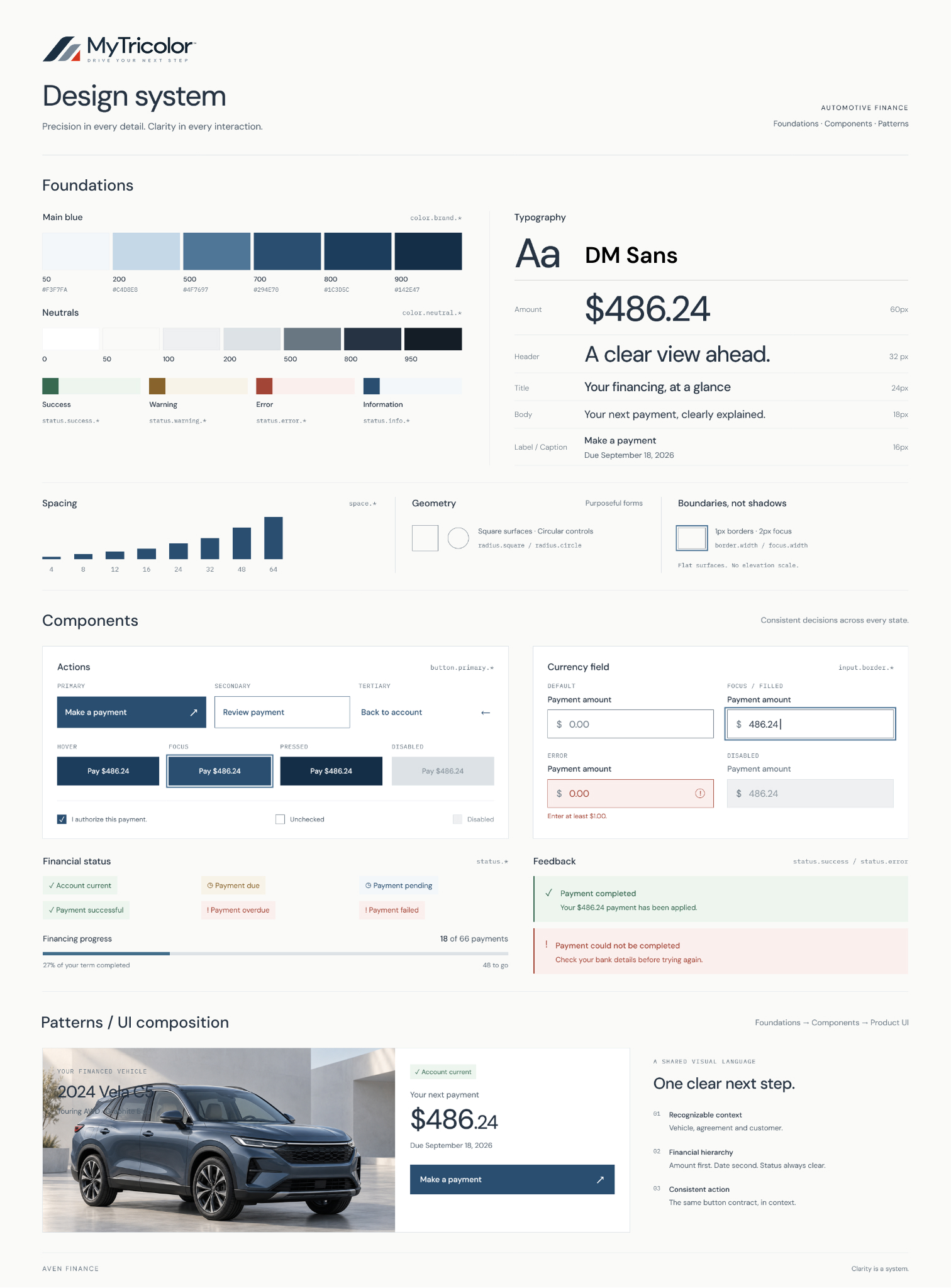
Rather than simply extending patterns from other products across the brand, MyTricolor required a system designed around its own customer needs: financial clarity, trust, accessibility and straightforward interactions.
I created a dedicated Design System that established its foundations, interaction patterns, semantic language and reusable components while remaining recognizable within the broader brand ecosystem.
A product decision.
A foundation for everything that follows.
Every detail.
One shared language.
Foundations → Components → Patterns
From visual decisions
to system architecture.
The system separates raw values from meaning and implementation. Each layer gives the next one a clear contract.
Primitives
Semantic tokens
Component tokens
Product UI
color.brand.700action.primary.defaultbutton.primary.backgroundPrimary actioncolor.error.600status.errorinput.border.errorValidation statespace.300control.padding.inlinebutton.padding.inlineControl spacingReadable in Figma.
Predictable in code.
| Figma Variables | Machine-readable paths |
|---|---|
| Color/Brand/700 | color.brand.700 |
| Color/Neutral/100 | color.neutral.100 |
| Action/Primary/Default | action.primary.default |
| Status/Error | status.error |
| Button/Primary/Background | button.primary.background |
| Input/Border/Focus | input.border.focus |
A system designed
for people
and machines.
Explicit meaning. Structured paths.
Decisions that travel across tools.
Predictable naming
Tokens communicate intent instead of arbitrary implementation values.
Semantic aliasing
Components consume semantic decisions instead of hardcoded primitive values.
Machine-readable structure
Structured tokens can be exported and consumed by development tools and automated workflows.
Shared context
Design, engineering and AI-assisted tools can operate from the same system language.
AI works inside
the system,
not instead of it.
The designer defines the architecture, semantics, components and rules. AI accelerates work within that system.
Audit & normalization
Identify repeated values, inconsistencies and opportunities for consolidation.
Context before implementation
Figma MCP connects design context and system information to AI-assisted development.
Review stays with people
Evaluate UX, accessibility, visual quality and consistency with the system.
- 01↓
Product context
Customer needs and product intent
- 02↓
Design System
Architecture, components and rules
- 03↕
Structured tokens /
Figma VariablesA predictable system language
- 04↕
Figma MCP
The design-context bridge
- 05↓
AI-assisted development
Established decisions, applied
- 06↓
Code
Implementation of the shared system
- 07
Review & validation
UX · Accessibility · Visual QA · System fit
One language from design
to implementation.
Structured tokens create a portable contract
between design and implementation.
- FIGMA COMPONENTButton / Primary↓
- COMPONENT TOKEN
button.primary.background↓ - SEMANTIC TOKEN
action.primary.default↓ - PRIMITIVE
color.brand.700↓ - CODE
var(--button-primary-background)↗
The system disappears.
The clarity stays.
Foundations, semantic decisions and components come together in a coherent customer experience.
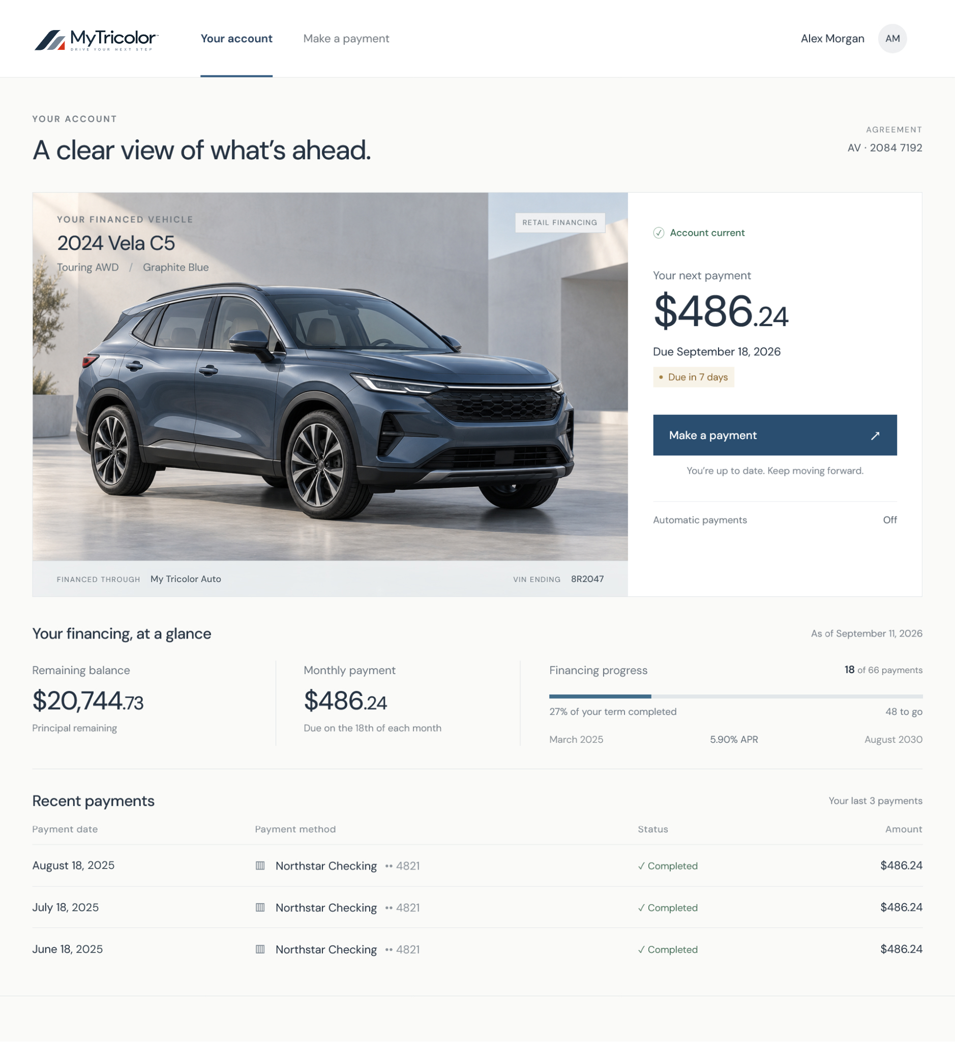
01 / Account overview
Recognizable context. A clear next step.
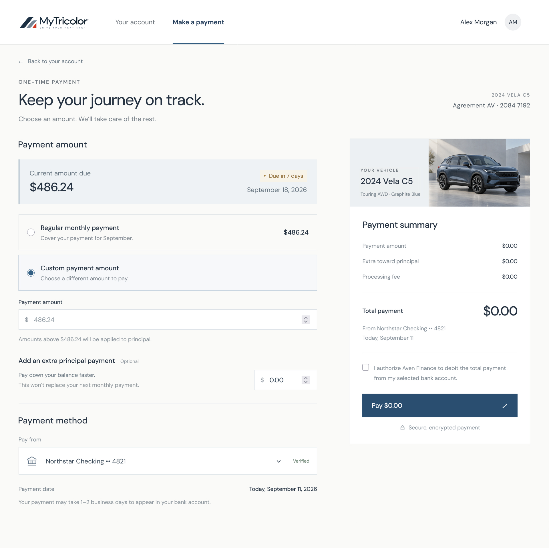
02 / Payment experience
One consistent language, through the detail.
A Design System is more
than a component library.
It is a shared product language for designers, developers, tools and AI-assisted workflows.